Travel Case + Bottle
2024


The Travel Case and Bottle were designed as objects that share branding and meaning behind a well known company.
The company I based my designs on is Rare Beauty, a cosmetics brand that focuses on accessibility and self discovery through cosmetics.
Created with SolidWorks and Keyshot
OBJECTIVE:
Take a preexisting brand (Rare Beauty), research the product language and create a new product they don't currently produce.
My goals and considerations:
-
Create a product that shares the branding.
-
Avoid recreating a preexisting product from the company.
-
Translate the ideation into a 3D rendering.
-
Maintain brand identity and mission.
RESEARCH:
I discovered Rare Beauty as a consumer of cosmetics. It was advertised everywhere when it first launched and it was apart of a trend of many celebrities launching beauty brands. In my research, I found that the founder struggled with hand mobility related to lupus.
Weak hands are a common struggle many people have because of age or illness and Rare Beauty considers how cosmetics are used by people of many different backgrounds, ages, and health. Rare Beauty products are designed with easy to hold, twist, and apply packaging that is often sacrificed in other brands for aesthetic appeal without considering who might be using them and how it can make the product easier to use day to day.


Wide easy to grip applicators.

The branding has a subtle but feminine approach, emphasizing softness in many of their products.
Rare Beauty™'s mission statement:
We believe in the beauty of imperfections.
We nurture a caring, respectful community.
We create meaningful connections and relationships.
We champion authenticity and positivity.
We lead with transparency to build trust.
We believe there is power in being vulnerable.
IDEATION:


I had two ideas that led my design ideation:
1. Something for everyone, an easy to open and operate shampoo container.
-
Strongly consider where physical dexterity could be implemented.
2. Something sustainable, I've recently started using solid shampoo but haven't found the best solution to traveling with it. (Comes in paper wrapping)
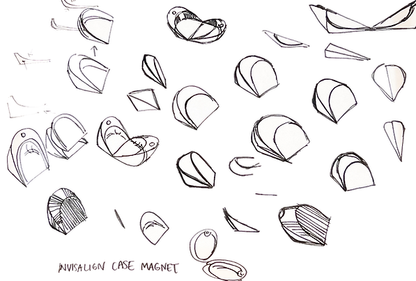
I started with a soap tray, using the "R" logo, although this was a fun idea, I did think that most people don't have shower space to have a tray rather than a slim bottle.
-
My professor Angie Lullie recommended I look at retainer cases.
-
I also looked at the shape of their product branding to inspire the shape of my case.
The solid shampoo case design was inspired by retainer cases, it needed to be portable as well as aesthetically pleasing when on display.
The design also needed to maintain the brand identity so I took inspiration from Rare Beauty's compact design.

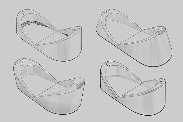
Portable Solid Shampoo Case
My final design for the shampoo case needed to be portable and retain the branding, taking from the design of a retainer case allows for a variety of different size products to fit within.
The power and authenticity behind the design and its branding is in its shape and its reusability.

Easy to operate Shampoo Bottle
The shampoo bottle was something that took a bit more research and iteration as it is more commercially available and approachable to consumers.
My initial approach was to research lifestyle brands to feed into the design language but I began to return to the "R" logo to make the bottle more accessible and tie to the branding by utilizing the graphic design within the products form.


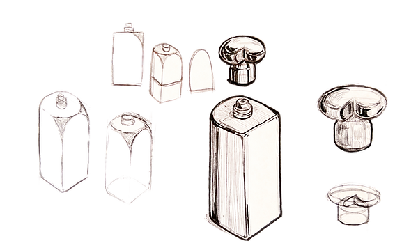
The form of the cap is meant to mimic the "R" logo that is iconic to the brand as well as make the cap easier to open by the ridge shape the "R" makes.
I also took from the disc shape of the applicator which is meant to make the applicator easier to twist and apart of the brands visual identity.

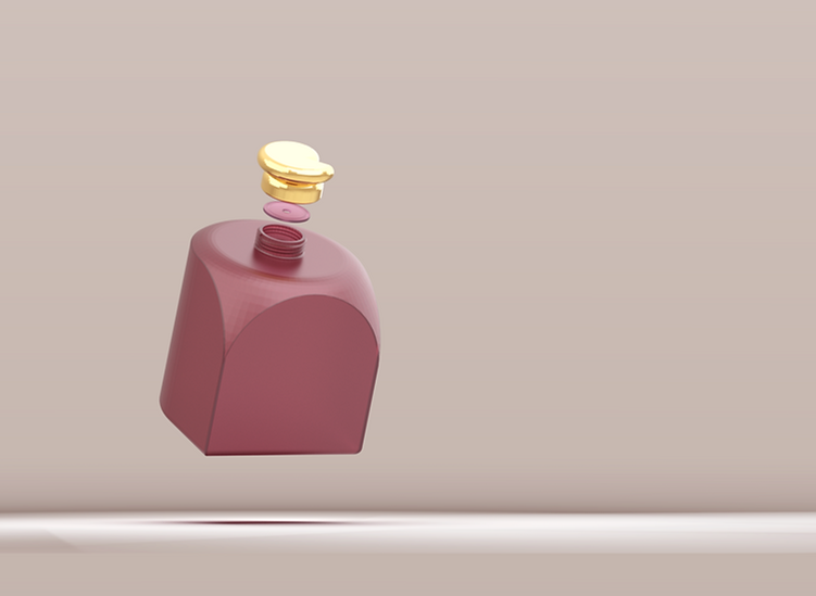
The color choices and textures were based off of Rare Beauty's color palate and also a way for me to express branding through color and material.
A muted warm color paired with metal.
SHAMPOO BOTTLE
FINAL RESULT

The bottle cap allows the user to open the bottle with greater dexterity, a less slippery and visually pleasing design.
I would have preferred the bottle to be longer but I used this as an opportunity to practice surfacing in SolidWorks
Lipstick for scale.


TRAVEL CASE
The Travel case was an additional product I designed as an alternative to a shampoo bottle. It's visually and conceptually simple but elegant. I used simple forms to mesh well in a bathroom setting and fillets to push the simplicity into sleekness.
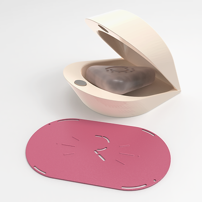


The travel case has a magnetic open and close mechanism to ensure it is securely closed during travel.
I also added a bar of soap and rubber mat that would fit inside the product to display usability and include an accessory that can function within as a easy to clean slip guard.
I used Keyshot to create the final rendered images. Going from sketches to rendering is something that helps me discover how to better inform my sketching through the process.
